Farm to Food
Simplifying grocery shopping and cooking in one app.

“Farm to Food” is a fictitious scenario, completed as a part of the Google UX Design course.
Project type: End-to-end app + branding
Role: Sole UX/UI Designer + Brand Designer
Industry: Retail trade
Tools: Figma, Miro, Google Slides, Google Sheets
Duration: October 2023 - January 2024
The problem:
Busy individuals lack the time and energy to shop for groceries in stores. The preparation needed for grocery shopping— brainstorming meal ideas, creating shopping lists, and coordinating travel with their household members, etc.— is exhausting!
The goal:
Design a grocery shopping app that allows users to easily and seamlessly place grocery orders and minimize their grocery shopping stress.
The product:
This grocery shopping app is designed for a local grocery shop that prides itself on their involvement in the community by showcasing local farmers and their in-season produce. The app aims to remove the difficulties of grocery shopping and cooking by offering flexible delivery and pickup times, personalized recipe suggestions, and ready-to-go meals.
Project Overview:
Mockups
High-fidelity prototype
Accessibility
Takeaways
Next steps
Paper wireframes
Digital wireframes
Low-fidelity wireframes
Usability studies
The Process
1. Empathize
User research
Personas
Problem statements
User journey maps
Empathize
Understanding the user
Personas
Problem statements
User journey maps
User Research Summary:
I conducted interviews and created empathy maps to better understand what users find enjoyable and frustrating about grocery shopping.
Through my research I found that users shared a common pain point: it is difficult for them to find the time and have energy to shop for groceries and cook, but also felt guilt when ordering takeout as a solution for meals. Users also found grocery shopping in-store unenjoyable and lacked trust in online ordering since they are not able to inspect their produce themselves.
Pain Points:
1. Time
Busy individuals lack the time and energy to plan meals and to go in-store to purchase groceries.
Customers are overwhelmed with indecision of what to buy, especially those who are inexperienced in cooking.
2. Overwhelmed
Customers feel distress and/or anxious when shopping during peak hours. They feel distrust in delivery services due to previous experiences of receiving low quality produce.
3. Stressed

“There’s not enough time in a day to do everything. Grocery shopping in-store is a major time sink for me.”
Meghan is a 27 year old busy working professional who needs a trustworthy method of ordering groceries biweekly. She would love the extra time to tend to her house, chores, and interests.
User Journey Map:
Mapping Meghan’s user journey demonstrated the importance that our app reassure users their groceries will be accurate, on time, and high-quality.

2. Starting the Design
Paper wireframes
Digital wireframes
Low-fidelity wireframes
Usability studies
Paper Wireframes:
Crazy Eights: The Homepage
I brainstormed these five versions of the homepage to create a visually appealing final homepage that displays user friendly sections with intriguing and useful information.
Version 1 of the final homepage is located on the bottom right corner.

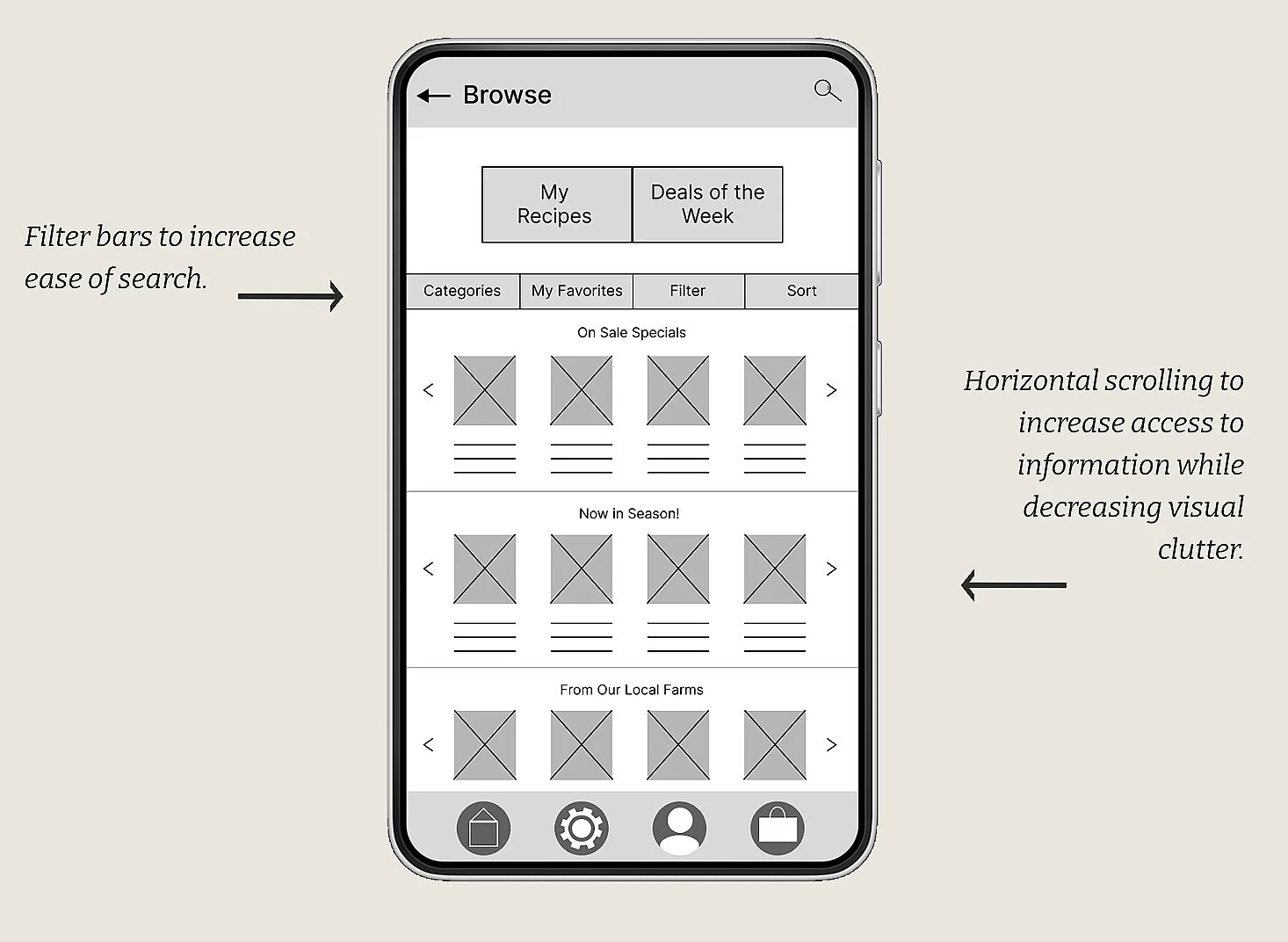
Digital Wireframes:
The Browsing Page
This wireframe of the browse page features categories users can scroll through to shop easily.
The “My Recipes” Page
The “My Recipes” page is one of the unique features of this app due to its personalized recipe suggestions. The quick “shop ingredients” button further simplifies the users’ shopping needs.

Low Fidelity Prototype:
The pathway of the low-fidelity prototype shows the user flow from start to finish.

Usability Study Findings:
Round 1 of the usability studies was conducted for the paper wireframes and Round 2 was conducted for the digital wireframes. The main findings are listed below.
Round 1 findings:
Users want to utilize filters to search for products.
Users had mixed feelings about taking a quiz to personalize their recipes.
Users would like more control over their recipes.
Round 2 findings:
Users felt the home bar could be expanded.
Users didn’t like the placement of the recipes quiz button.
Users felt the shapes of buttons were outdated.
These findings were crucial in guiding the next steps in the design process. You’ll see these findings incorporated in the next phase.
3. Refining the Design
Mockups
High-fidelity prototype
Accessibility
Mockups:

The Homepage

The Browse Page

User Flow From Homepage -> Checkout
High-Fidelity Prototype:
The pathway of the high-fidelity prototype is shown below.

Accessibility Considerations:
Contrast between text and background were checked according to official WCAG guidelines.
1.
“View all” buttons were included next to areas with horizontal scrolling to accommodate those with limited swiping motion.
2.
Text was added to accompany icons to reduce ambiguity.
3.
4. Going Forward
Takeaways
Next steps
Takeaways:
Impact:
The design of this grocery shopping app appeals to users through its genuine consideration and efforts to meet their lifestyle needs.
Quote from the second usability study:
“I really like the recipe “shop ingredients” feature! That would make shopping and cooking so much faster.”
✔
What I learned:
I conducted user research to learn about participants’ existing thoughts and opinions about grocery shopping. I experienced first hand how important it is to conduct user research on app features prior to designing as well. Researching the usability of potential features prior to designing saves the time and money it would take to reiterate designs further down the road.
✔
Next Steps:
Conduct another usability study to check if the users’ pain points were addressed properly.
1.
Explore additional possible features that could be added to enhance our users’ experiences.
2.
Explore how accessible the app is by recruiting participants that represent an inclusive sample.