Mariposa Bakery
A beloved local cafe and bakery in the heart of Cambridge, Massachusetts.
Project type: End-to-end responsive website and mobile redesign + branding
Role: Sole UX/UI Designer + Brand Designer
Industry: Hospitality
Tools: Figma, Miro, Freeform, Google Forms, Google Sheets
Duration: June 2024 - ongoing
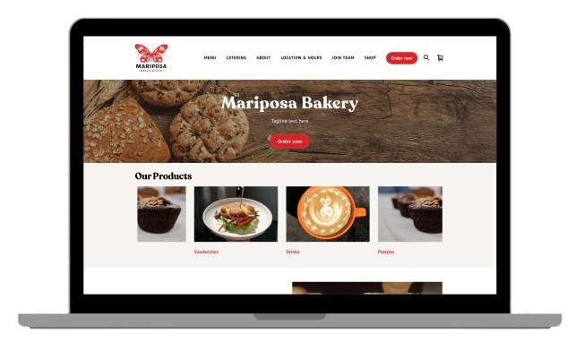
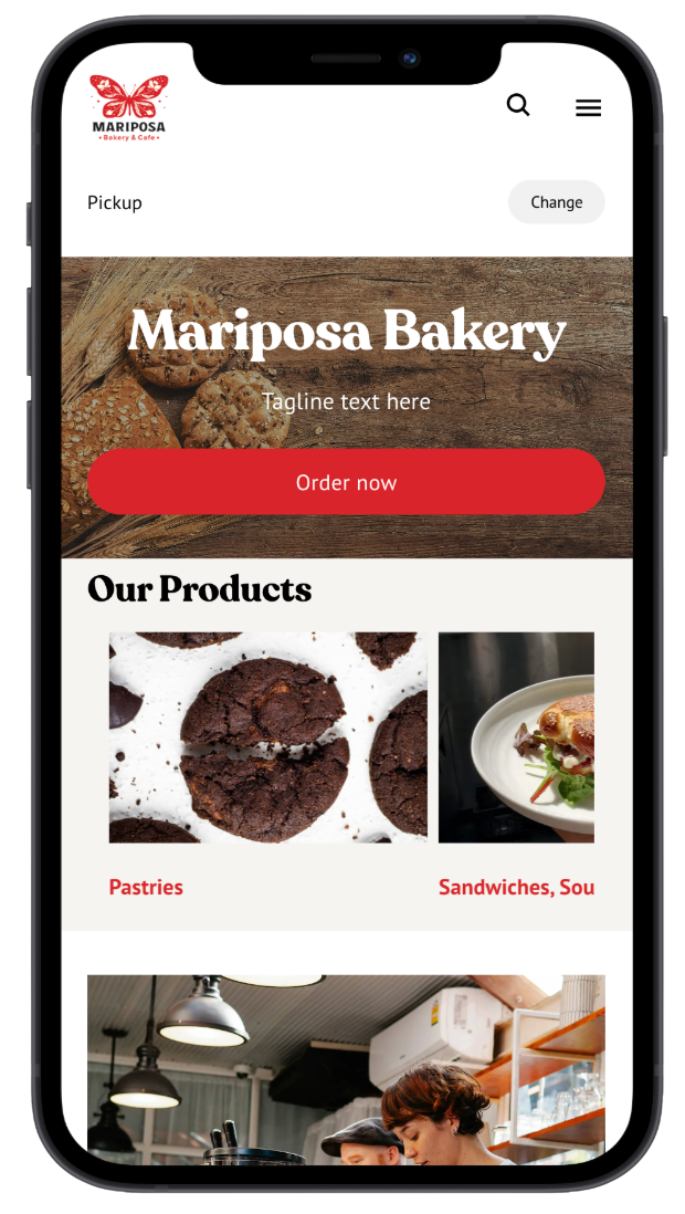
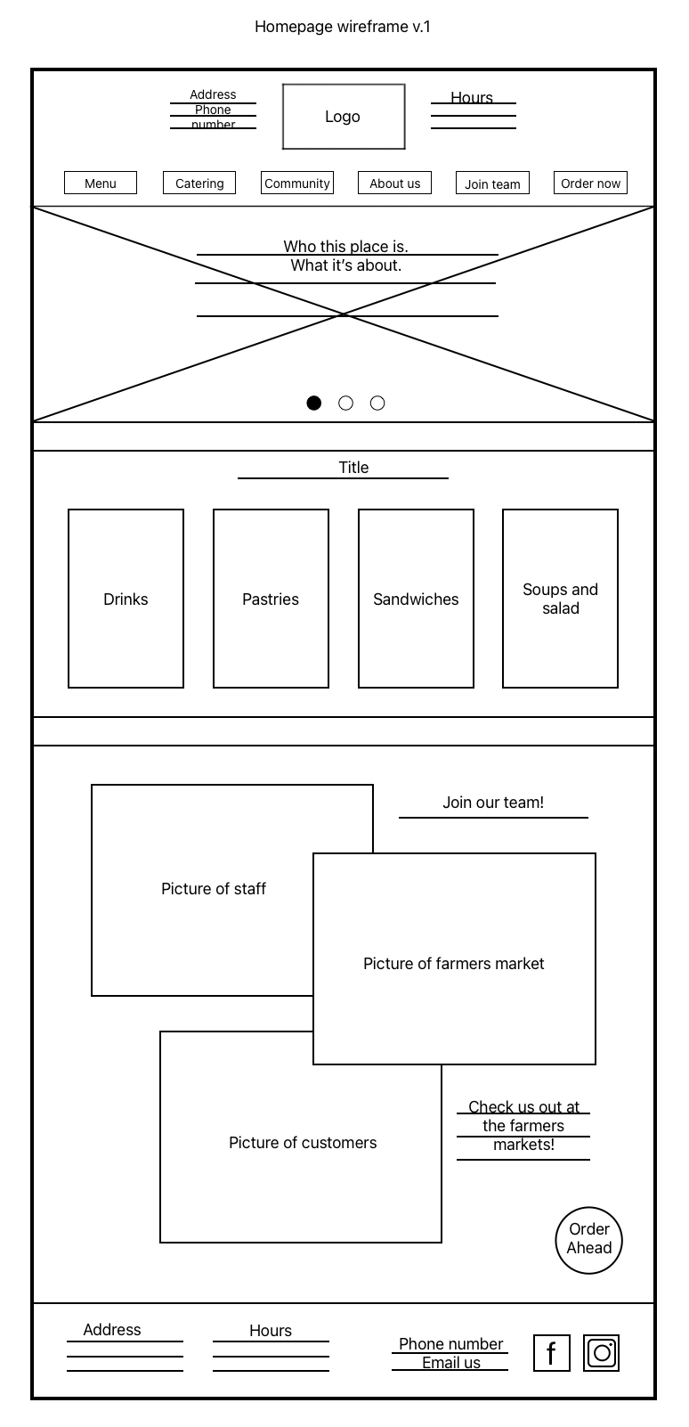
A Sneak Peak Into the Design
The Process (so far…)
1. Introduction
● The objective ● Meeting with stakeholders ● Realistic limitations
Who is Mariposa Bakery?
Mariposa Bakery is a small cafe and bakery located in Cambridge, MA with a website as old as the bakery itself: 19 years! More than ever customers prefer to order ahead, particularly on their mobile devices, and small businesses like Mariposa have to meet this demand in order to keep up with competitors and stay afloat. This is where my role comes in.
The Objective:
Rebrand
Refresh
Restructure
Before we dive into the design process, we first have to address the needs of the client. After a couple meetings with various stakeholders, I identified the bakery owner’s top three concerns as cost, usability, and design freedom.

“What is the most important to me is the annual cost, how easy the site is to use, and being able to alter the site as I please.”
Limitations:
With the client needs explored, it was time to address limitations. I investigated further and came to the realization that the design will be limited to the capabilities of a platform that supports the bakery’s payment processing system and payroll manager: Square.
From there, I completed an audit of platforms to compare annual costs and narrowed the results to those that supported Square. So which platform ended up checking all the boxes? Square Online! We are one step closer to research and design.
2. Getting to Know the Users
● Surveys ● Organizing the data ● User persona ● Findings
User Research Summary:
Using Google Forms, I created a short survey composed of eight questions to investigate what challenges users faced when ordering online, how the current Mariposa website made them feel, what features they’d like to see added or removed from the website, and Mariposa’s unique value proposition. The survey produced 15 responses from real Mariposa customers in two weeks.
Organizing the Data:
To organize the survey responses, I first created affinity maps. The result was five clusters of the following topics:
Users’ experience with navigation
Website impressions
Concerns regarding online ordering
Things users would like to see
Mariposa’s unique value proposition


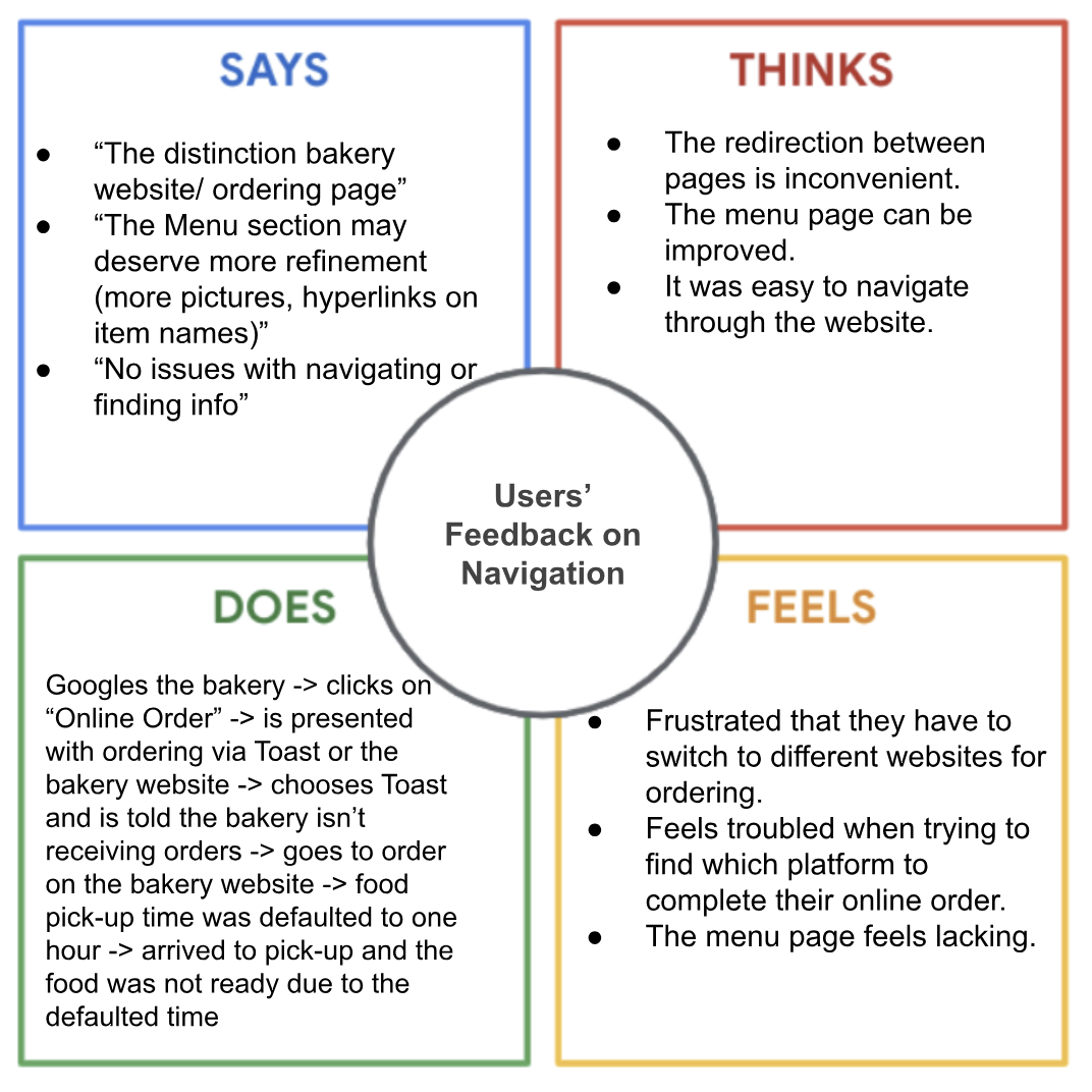
Further organizing the data to understand the user, I distilled the affinity maps into empathy maps. These five clusters could be grouped into three themes:
Users’ feedback on navigation
Users’ feedback on design
Users’ feedback on online ordering


Getting to know our users:

Nat Alves
Age: 30 years old
Education: BA
Hometown: Cambridge, MA
Household: Single
Occupation: Software engineer
“I juggle a lot of moving parts every day so having enough time to grab a quick coffee or snack and get back to work to complete my task list is necessary.”
His Goals:
To have more spare time to focus on what is important to me
To get a promotion at work this year
To reduce stress and improve my daily habits
His Frustrations:
“I’m a picky eater so I need to be able to remove ingredients or put comments.”
“Lack of accessibility to info about dishes while ordering is a huge roadblock.”
“It’s frustrating when I can’t choose my pickup time so when I arrive, my order is not ready.”
Nat A. is a software engineer with a hybrid work schedule that is striving for a promotion this year. Outside of work, they spend most of their time tending to their many responsibilities: errands, chores, social obligations, and planning for the future. They often feel they do not have enough time in a day to themselves.
The Findings:
Utilizing the data I’ve collected and organized, I was able to put myself in the user’s shoes and discover these 3 major pain points:
1. Inflexible Pickup Time
The survey revealed this to be the most common pain point amongst users. The users are frustrated by the website’s defaulted one hour wait time for all orders. There was no way to alter the pickup time nor track their order status.
2. Order Customization
Users were hesitant to place orders through the online ordering system due to lack of control over their orders.
3. Lack of Information
Users often faced difficulty ordering from restaurants that provided a limited amount of information about their food products. From taste preferences to allergies, users expressed a need for more details about their food.
The Goal:
Our redesign will let users customize their orders and pick-up times, which will affect new and existing Mariposa customers by increasing their satisfaction and reducing confusion with the online ordering process. We will measure effectiveness by recording any changes in the number of online sales completed.
3. Crazy Eights
● Paper wireframes
Time to Design!

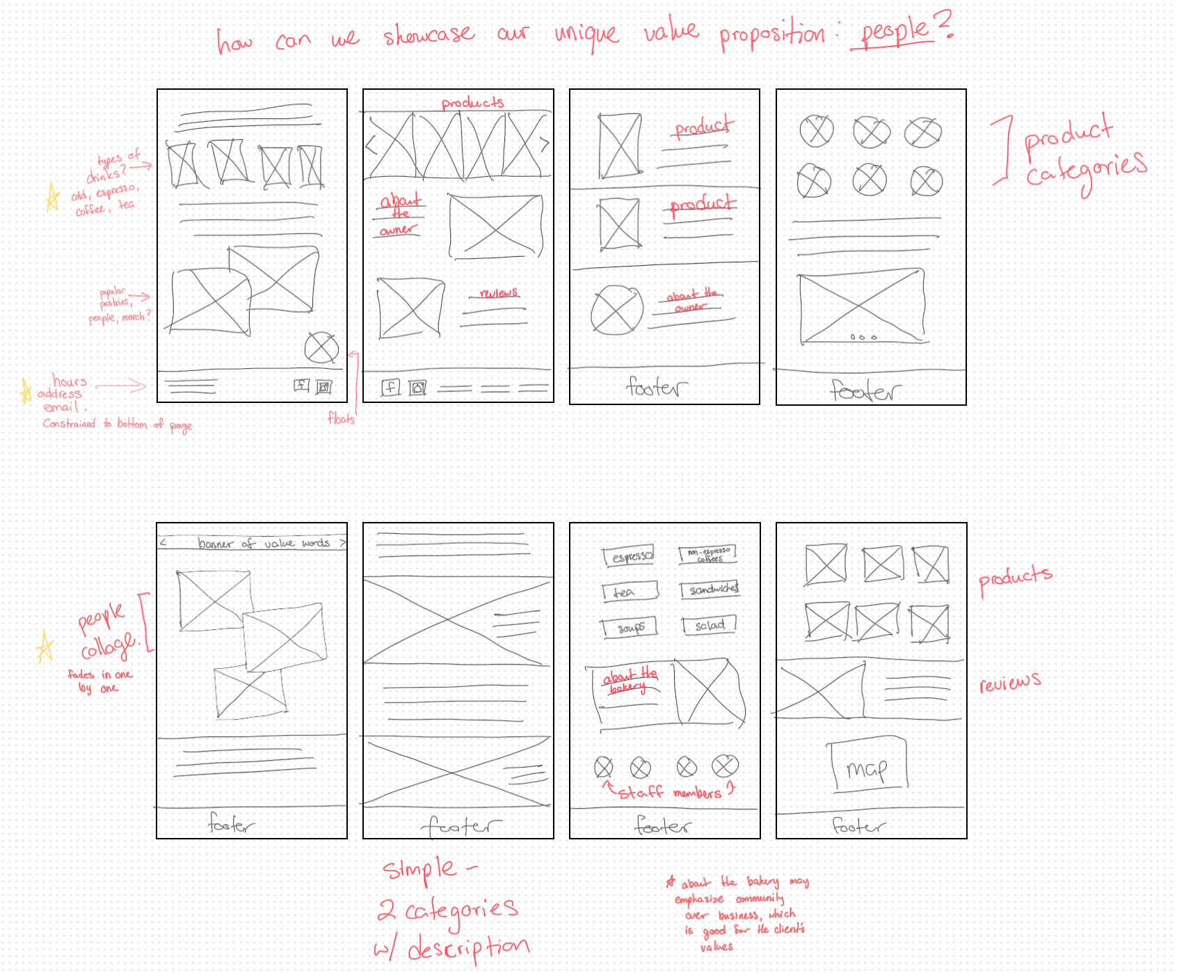
Utilizing the crazy eights method, I started with the homepage. Below are a few images of the paper wireframes created during this process. The image shows a portion of the homepage. It was designed with the user’s first impression in mind: this is what they’ll see when they click into the website.
After the crazy eights was completed, I highlighted the best features and combined them to create this final version:

I went through another cycle of crazy eights to design the remainder of the homepage. Check it out below!
⟶
4. Upcoming Steps
● Meet with stakeholders ● Usability interviews ● Reiterate ● Launch
Hey Cindy, Where’s The Rest?
The next step of this project is to have a meeting with the stakeholders to hear their thoughts on the direction of the design, features, etc. It’s important to have meetings like these early on in the design process in order to save time and prevent excess expenses spent on reiterating whole designs. The plan following this meeting is:
Explore and incorporate any crucial feedback from stakeholders
Conduct usability interviews to test the product
Reiterate as needed
Launch!
Come back soon to follow along the lifecycle of Mariposa Bakery!